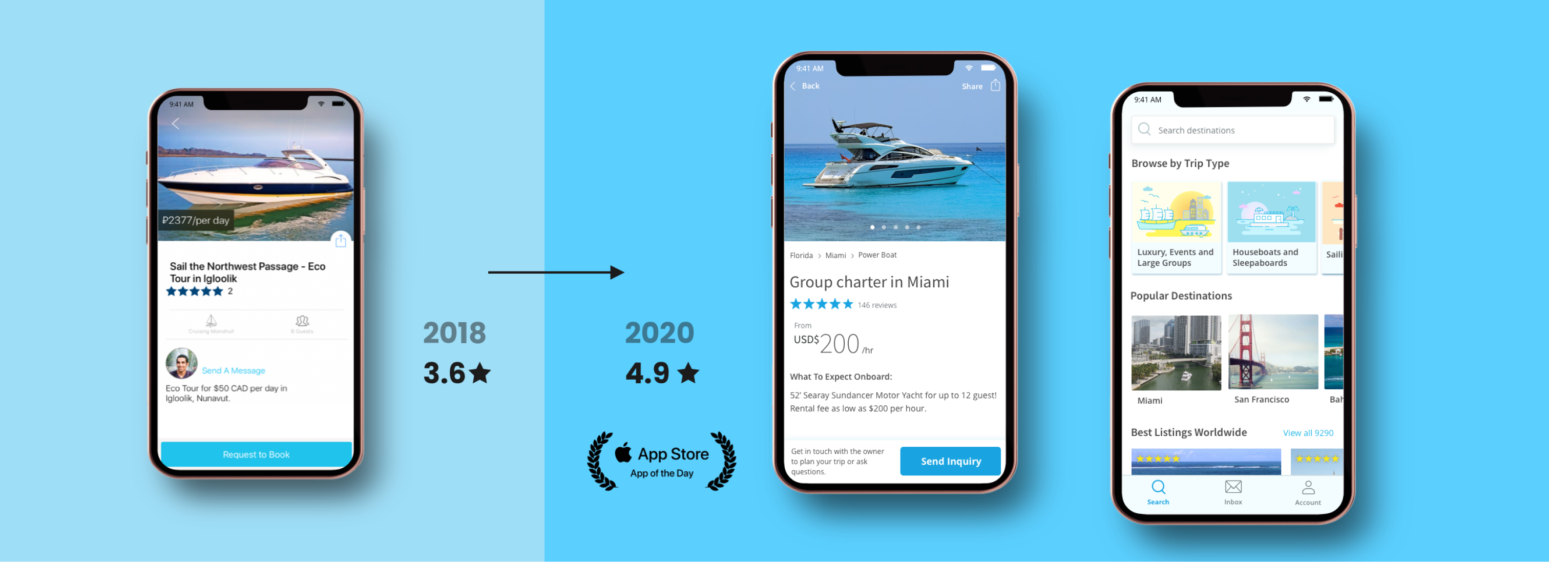
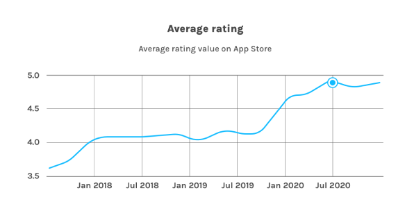
I joined GetMyBoat in 2018, as a Product Designer and acting Product Manager for the mobile apps. My main objective was to improve the user experience and reviews of the apps. The redesigns of the app led to the App store rating going from 3.6 → 4.9 in 2 years.
GetMyBoat is the biggest marketplace for boat rentals. Launched in 2013, GetMyBoat now has over 150,000 listings in 184 countries. GetMyBoat is a fully remote team.

When I joined, GetMyBoat was a very small, bootstrapped startup. At that point, the mobile team had only two developers. What’s more, we had constrained design and QA resources.
iOS and Android apps had a very inconsistent design, confusing navigation, and many usability issues.
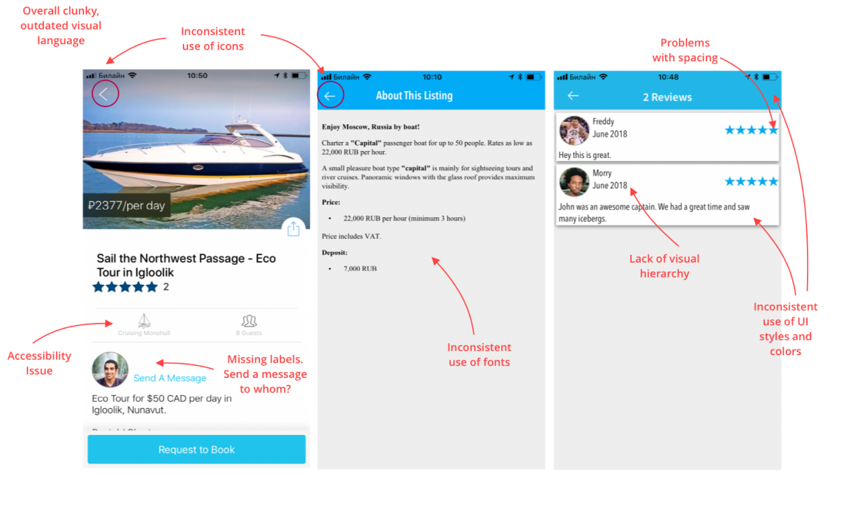
My main objective was to improve the general experience of the apps and, in this way, improve the ratings. Since low rating (3.6) was bad for the brand and user retention.
I started the process by collecting the data about the apps.
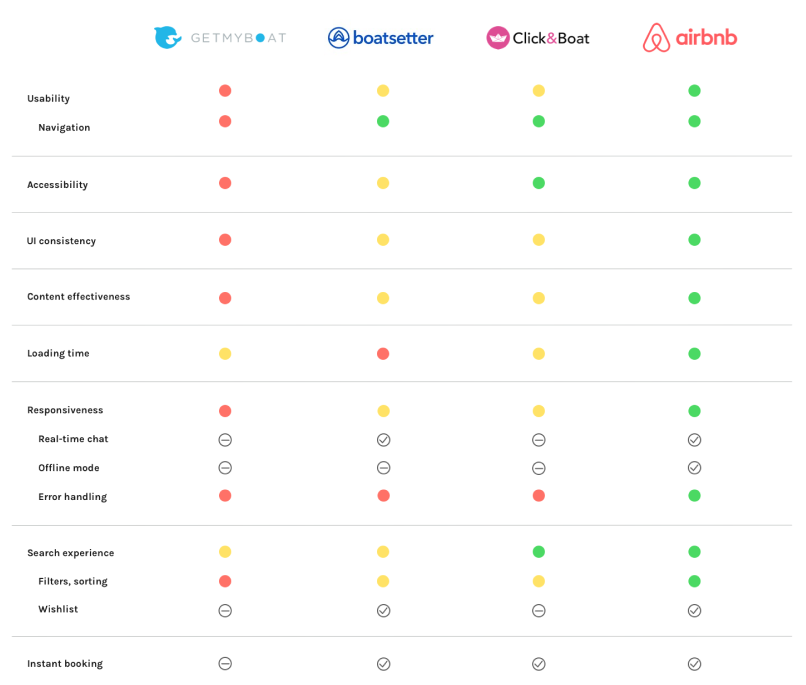
Competitor analysis.
What I found:
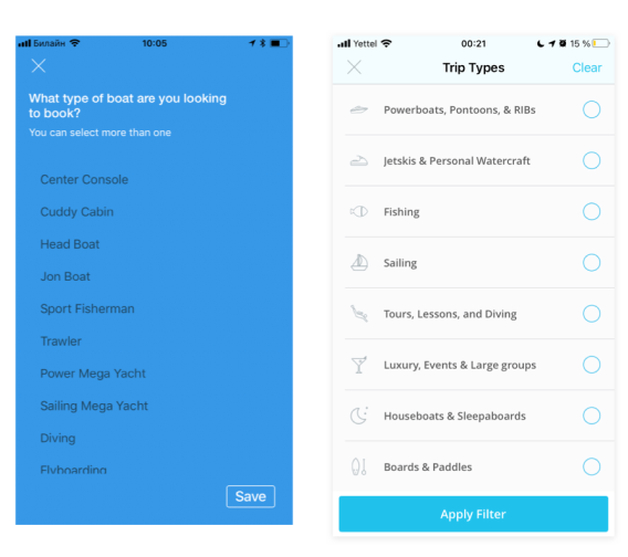
Search filter before and after redesign.
From these findings, I understood that apart from visual inconsistency and problems with usability, we also need to improve the apps' content, stability, productivity, and responsiveness to make sure they meet the expectations of our users and get good reviews. Following all the research I put together a list of improvements.
The main problem was that at this point, we had only two developers and one QA (she had to test 3 platforms). In addition, new features needed to be integrated into the apps. Meaning our very small dev team had limited time to improve the current functionality.
To overcome this challenge we conducted a brainstorming session with the dev and product team and came up with the strategy of addressing our limitations:
I decided to dedicate some part of my time to QA testing. On the one hand, I felt that it would improve the quality of the review if at least two people did the checks. But, on the other hand, it will help me learn deeply about how the app works.
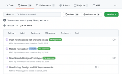
Technical and usability issues logged on GitHub.
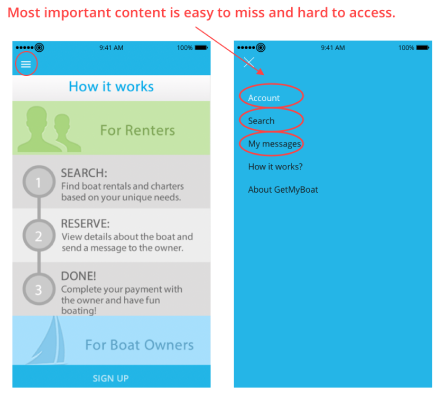
App navigation presented one of the biggest usability issues. Hamburger menus are in general easy to miss. In the case of the GetMyBoat, the hamburger menu made crucial content both hard to discover and access. Chat was hidden 5 clicks away from the main screen.
The main two goals of the navigation redesign were to make content easy to find and make it easy to access by reducing the number of clicks in order to reach important functions. To discover what is the most important content for our uses I looked at the most visited pages by user type on Google Analytics and also analyzed examples of marketplaces.
I tried to improve the current navigation but, it soon became clear that we will need to get rid of the hamburger menu and switch to the bottom menu to achieve our goals. I also had to completely change the color of navigation. The overwhelmingly bright color of the navigation background was competing with the content and left almost no space for any additional visual emphasis.
During two years of revamping the app the mobile team:
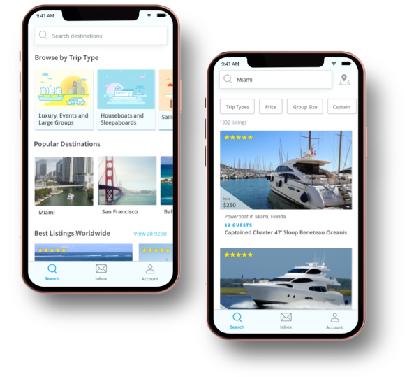
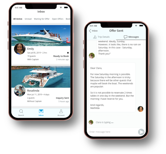
As the team continued with improvements work, we started seeing the first results reflected in internally collected user feedback.
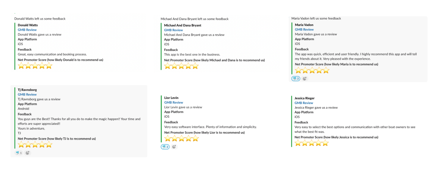
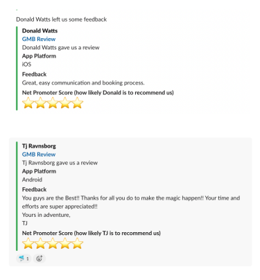
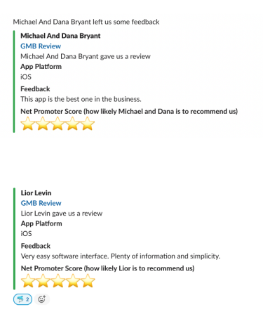
The team started to see improvement in App Store and Google Play ratings. Android app rating went from 3.5 in 2019 to 4.8 in 2020. Likewise, the iOS app rating went from 3.6 to 4.9.
And in 2021, we were awarded the best app of the day by App Store.
By 2021 70% of all owner interactions were done via mobile apps (compared to around 20% in 2018). Higher mobile apps adoption rates among owners helped us to boost response times and positively contributed to the general conversion rates into booking.